Create Stunning Image Galleries with the CSS Grid Layout
How to Create Stunning Image Galleries with the CSS Grid Layout
Introduction:
As web developers, one of our primary goals is to create visually appealing websites that engage visitors. One way to achieve this is by using image galleries to showcase a collection of photos or images. In this blog post, we will explore how to create stunning image galleries using the CSS Grid Layout.
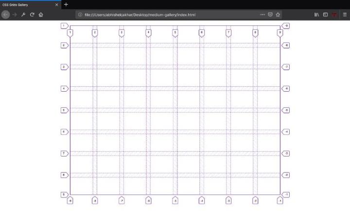
What is the CSS Grid Layout?
The CSS Grid Layout is a powerful layout system for CSS that allows us to create complex grid-based layouts with ease. It gives us precise control over the positioning and sizing of elements on a web page, making it an excellent choice for creating image galleries.
Step 1: HTML Markup
To get started, let’s set up the basic HTML structure for our image gallery. We’ll create a container element to hold all the images, and each image will be wrapped in a div element.
Step 2: CSS Grid Properties
Next, let’s apply the CSS Grid properties to our container element. We’ll set the display property to ‘grid’ and define the number of columns and rows we want for our gallery. We can also specify the size of each column and row using the ‘grid-template-columns’ and ‘grid-template-rows’ properties.
Step 3: Positioning the Images
Now that we have our grid set up, we can position the images within it. We can use the ‘grid-column’ and ‘grid-row’ properties to specify where each image should be placed on the grid. By adjusting these properties, we can create different layouts, such as a grid, a masonry-style layout, or even an asymmetrical layout.
Step 4: Styling the Images
Finally, let’s add some styling to make our image gallery visually appealing. We can apply styles such as borders, shadows, and transitions to enhance the overall look and feel of the gallery. Additionally, we can use CSS animations to create beautiful image transitions or hover effects.
Frequently Asked Questions (FAQs)
Q1: Can I create a responsive image gallery using CSS Grid?
Yes, absolutely! CSS Grid is a responsive layout system by default. By using media queries and responsive units like percentages, we can make our image gallery adapt to different screen sizes and devices.
Q2: Are there any browser compatibility issues with CSS Grid?
CSS Grid is supported by all modern browsers, including Chrome, Firefox, Safari, and Edge. However, it’s always a good practice to check the browser compatibility of any CSS feature before implementing it. You can use tools like Can I use (caniuse.com) to check the support for CSS Grid in different browsers.
Q3: Can I animate the images in my CSS Grid image gallery?
Yes, you can! CSS Grid Layout works seamlessly with CSS animations. By applying animation properties like ‘transition’ or ‘animation’ to the images or their parent elements, you can create stunning animated effects to impress your visitors.
Conclusion
By harnessing the power of CSS Grid Layout, we can easily create stunning image galleries that enhance the visual appeal of our websites. With its flexibility and responsiveness, CSS Grid opens up endless possibilities for creating unique and eye-catching designs. So, why not give it a try and take your image galleries to the next level!
Remember to keep experimenting and exploring what CSS Grid has to offer to unleash your creativity in designing image galleries that leave a lasting impression on your website visitors.